5 Cleaning the expression matrix
5.1 Expression QC
5.1.1 Introduction
Once gene expression has been quantified it is refer to it as an expression matrix where each row corresponds to a gene (or transcript) and each column corresponds to a single cell. This matrix should be examined to remove poor quality cells which were not detected in either read QC or mapping QC steps. Failure to remove low quality cells at this stage may add technical noise which has the potential to obscure the biological signals of interest in the downstream analysis.
Since there is currently no standard method for performing scRNA-seq the expected values for the various QC measures that will be presented here can vary substantially from experiment to experiment. Thus, to perform QC we will be looking for cells which are outliers with respect to the rest of the dataset rather than comparing to independent quality standards. Consequently, care should be taken when comparing quality metrics across datasets collected using different protocols.
5.1.2 Tung dataset (UMI)
To illustrate cell QC, we consider a
dataset of
induced pluripotent stem cells generated from three different
individuals (Tung et al. 2017) in
Yoav Gilad’s lab at the
University of Chicago. The experiments were carried out on the
Fluidigm C1 platform and to facilitate the quantification both unique
molecular identifiers (UMIs) and ERCC spike-ins were used. The data
files are located in the data/tung folder in your working directory.
These files are the copies of the original files made on the 15/03/16.
We will use these copies for reproducibility purposes.
Load the data and annotations:
molecules <- read.table("data/tung/molecules.txt", sep = "\t")
anno <- read.table("data/tung/annotation.txt", sep = "\t", header = TRUE)
Inspect a small portion of the expression matrix
##                 NA19098.r1.A01 NA19098.r1.A02 NA19098.r1.A03
## ENSG00000237683              0              0              0
## ENSG00000187634              0              0              0
## ENSG00000188976              3              6              1
## ENSG00000187961              0              0              0
## ENSG00000187583              0              0              0
## ENSG00000187642 0 0 0## individual replicate well batch sample_id
## 1 NA19098 r1 A01 NA19098.r1 NA19098.r1.A01
## 2 NA19098 r1 A02 NA19098.r1 NA19098.r1.A02
## 3 NA19098 r1 A03 NA19098.r1 NA19098.r1.A03
## 4 NA19098 r1 A04 NA19098.r1 NA19098.r1.A04
## 5 NA19098 r1 A05 NA19098.r1 NA19098.r1.A05
## 6 NA19098 r1 A06 NA19098.r1 NA19098.r1.A06The data consists of 3 individuals and 3 replicates and therefore has 9 batches in total.
We standardize the analysis by using both SingleCellExperiment
(SCE) and scater packages. First, create the SCE object:
## class: SingleCellExperiment
## dim: 19027 864
## metadata(0):
## assays(1): counts
## rownames(19027): ENSG00000237683 ENSG00000187634 ... ERCC-00170
##   ERCC-00171
## rowData names(0):
## colnames(864): NA19098.r1.A01 NA19098.r1.A02 ... NA19239.r3.H11
##   NA19239.r3.H12
## colData names(5): individual replicate well batch sample_id
## reducedDimNames(0):
## spikeNames(0):
Remove genes that are not expressed in any cell:
Define control features (genes) - ERCC spike-ins and mitochondrial genes (provided by the authors):
isSpike(umi, "ERCC") <- grepl("^ERCC-", rownames(umi))
isSpike(umi, "MT") <- rownames(umi) %in%
    c("ENSG00000198899", "ENSG00000198727", "ENSG00000198888",
    "ENSG00000198886", "ENSG00000212907", "ENSG00000198786",
    "ENSG00000198695", "ENSG00000198712", "ENSG00000198804",
    "ENSG00000198763", "ENSG00000228253", "ENSG00000198938",
    "ENSG00000198840")
Next we use the calculateQCMetrics() function in the
scater package to calculate quality control metrics.
We refer users to the ?calculateQCMetrics for a full list of
the computed cell-level metrics. However, we will describe
some of the more popular ones here.
For example, some cell-level QC metrics are:
total_counts: total number of counts for the cell (i.e., the library size)total_features_by_counts: the number of features for the cell that have counts above the detection limit (default of zero)pct_counts_X: percentage of all counts that come from the feature control set namedX
Some feature-level metrics include:
mean_counts: the mean count of the gene/featurepct_dropout_by_counts: the percentage of cells with counts of zero for each genepct_counts_Y: percentage of all counts that come from the cell control set namedY
Let’s try calculating the quality metrics
umi <- calculateQCMetrics(
    umi,
    feature_controls = list(
        ERCC = isSpike(umi, "ERCC"),
        MT = isSpike(umi, "MT")
    )
)
umi
## class: SingleCellExperiment
## dim: 18726 864
## metadata(0):
## assays(1): counts
## rownames(18726): ENSG00000237683 ENSG00000187634 ... ERCC-00170
## ERCC-00171
## rowData names(9): is_feature_control is_feature_control_ERCC ...
## total_counts log10_total_counts
## colnames(864): NA19098.r1.A01 NA19098.r1.A02 ... NA19239.r3.H11
## NA19239.r3.H12
## colData names(50): individual replicate ...
## pct_counts_in_top_200_features_MT
## pct_counts_in_top_500_features_MT
## reducedDimNames(0):
## spikeNames(2): ERCC MTIf exprs_values is set to something other than “counts”, the
names of the metrics will be changed by swapping “counts” for
whatever named assay was used.
5.1.3 Cell QC
5.1.3.1 Library size
Next we consider the total number of RNA molecules detected per sample (if we were using read counts rather than UMI counts this would be the total number of reads). Wells with few reads/molecules are likely to have been broken or failed to capture a cell, and should thus be removed.
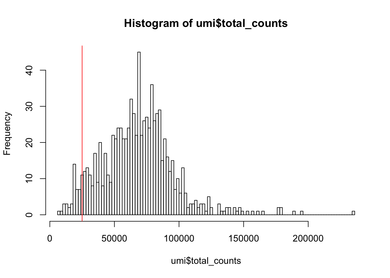
Figure 5.1: Histogram of library sizes for all cells
How many cells does our filter remove?
## filter_by_total_counts
## FALSE  TRUE
##    46   818
5.1.3.2 Detected genes
In addition to ensuring sufficient sequencing depth for each sample, we also want to make sure that the reads are distributed across the transcriptome. Thus, we count the total number of unique genes detected in each sample.
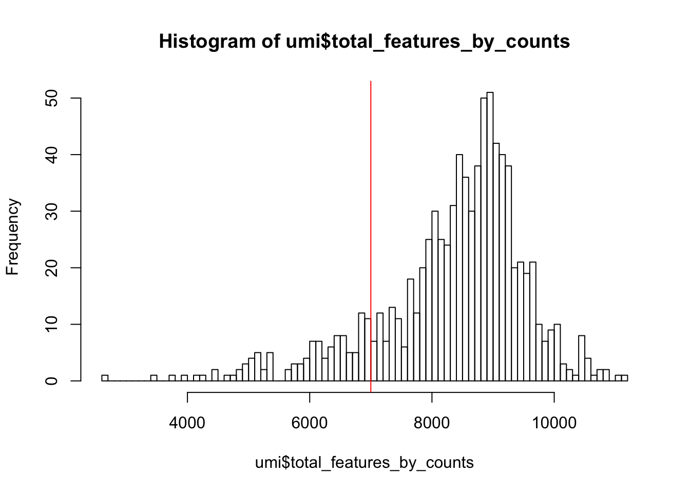
Figure 5.2: Histogram of the number of detected genes in all cells
From the plot we conclude that most cells have between 7,000-10,000 detected genes,which is normal for high-depth scRNA-seq. However, this varies byexperimental protocol and sequencing depth. For example, droplet-based methods or samples with lower sequencing-depth typically detect fewer genes per cell. The most notable feature in the above plot is the “heavy tail” on the left hand side of the distribution. If detection rates were equal across the cells then the distribution should be approximately normal. Thus we remove those cells in the tail of the distribution (fewer than 7,000 detected genes).
How many cells does our filter remove?
## filter_by_expr_features
## FALSE  TRUE
##   116   748
5.1.3.3 ERCCs and MTs
Another measure of cell quality is the ratio between ERCC spike-in RNAs and endogenous RNAs. This ratio can be used to estimate the total amount of RNA in the captured cells. Cells with a high level of spike-in RNAs had low starting amounts of RNA, likely due to the cell being dead or stressed which may result in the RNA being degraded.
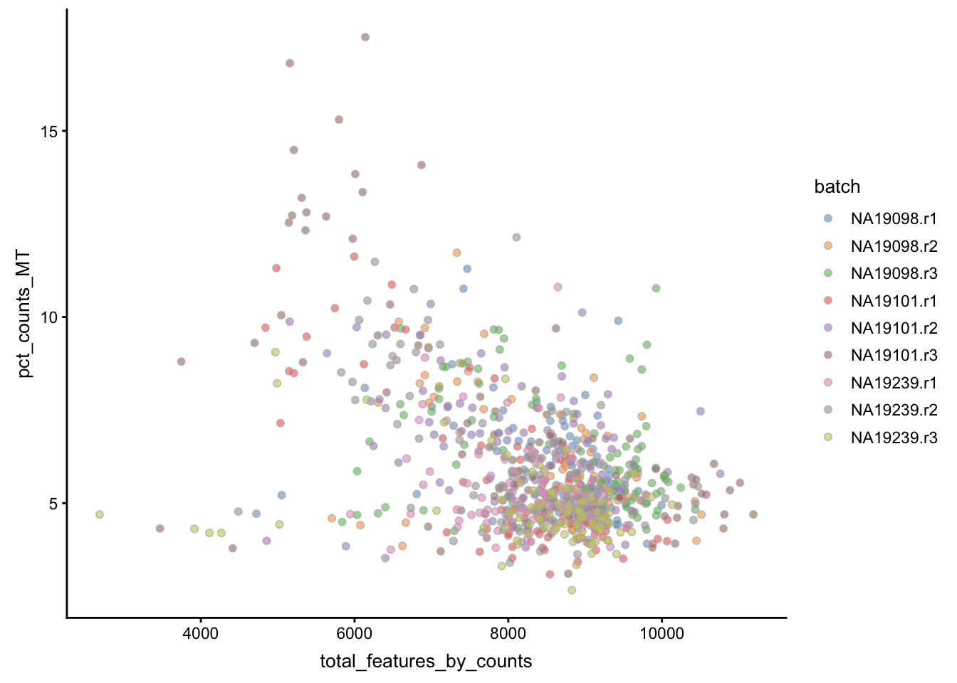
Figure 5.3: Percentage of counts in MT genes
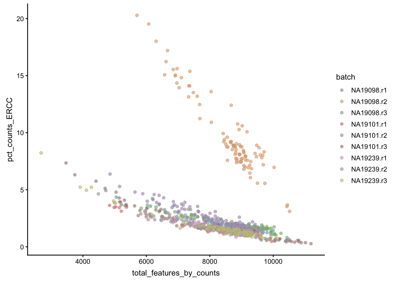
Figure 5.4: Percentage of counts in ERCCs
The above analysis shows that majority of the cells from NA19098.r2
batch have a very high ERCC/Endo ratio. Indeed, it has been shown by the
authors that this batch contains cells of smaller size.
Let’s create filters for removing batch NA19098.r2 and cells with
high expression of mitochondrial genes (>10% of total counts in a cell).
## filter_by_ERCC
## FALSE  TRUE
## 96 768## filter_by_MT
## FALSE TRUE
## 31 8335.1.4 Cell filtering
5.1.4.1 Manual
Now we can define a cell filter based on our previous analysis:
umi$use <- (
    # sufficient features (genes)
    filter_by_expr_features &
    # sufficient molecules counted
    filter_by_total_counts &
    # sufficient endogenous RNA
    filter_by_ERCC &
    # remove cells with unusual number of reads in MT genes
    filter_by_MT
)##
## FALSE TRUE
## 207 6575.1.4.2 Automatic
Another option available in scater is to conduct PCA on
a set of QC metrics and then use automatic outlier detection
to identify potentially problematic cells.
By default, the following metrics are used for PCA-based outlier detection:
- pct_counts_top_100_features
- total_features
- pct_counts_feature_controls
- n_detected_feature_controls
- log10_counts_endogenous_features
- log10_counts_feature_controls
scater first creates a matrix where the rows represent cells and
the columns represent the different QC metrics. Then, outlier cells
can also be identified by using the mvoutlier package
on the QC metrics for all cells. This will identify cells that have
substantially different QC metrics from the others, possibly corresponding
to low-quality cells. We can visualize any outliers using a
principal components plot as shown below:
## [1] "PCA_coldata"Column subsetting can then be performed based on the $outlier
slot, which indicates whether or not each cell has been
designated as an outlier. Automatic outlier detection can
be informative, but a close inspection of QC metrics and
tailored filtering for the specifics of the dataset at
hand is strongly recommended.
##
## FALSE  TRUE
##   791    73
Then, we can use a PCA plot to see a 2D representation of the cells ordered by their quality metrics.
plotReducedDim(umi, use_dimred = "PCA_coldata",
               size_by = "total_features_by_counts",
               shape_by = "use",
               colour_by="outlier")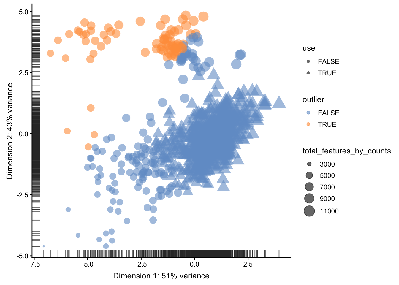
5.1.5 Compare filterings
We can compare the default, automatic and manual cell filters. Plot a Venn diagram of the outlier cells from these filterings.
We will use vennCounts() and vennDiagram() functions from the
limma
package to make a Venn diagram.
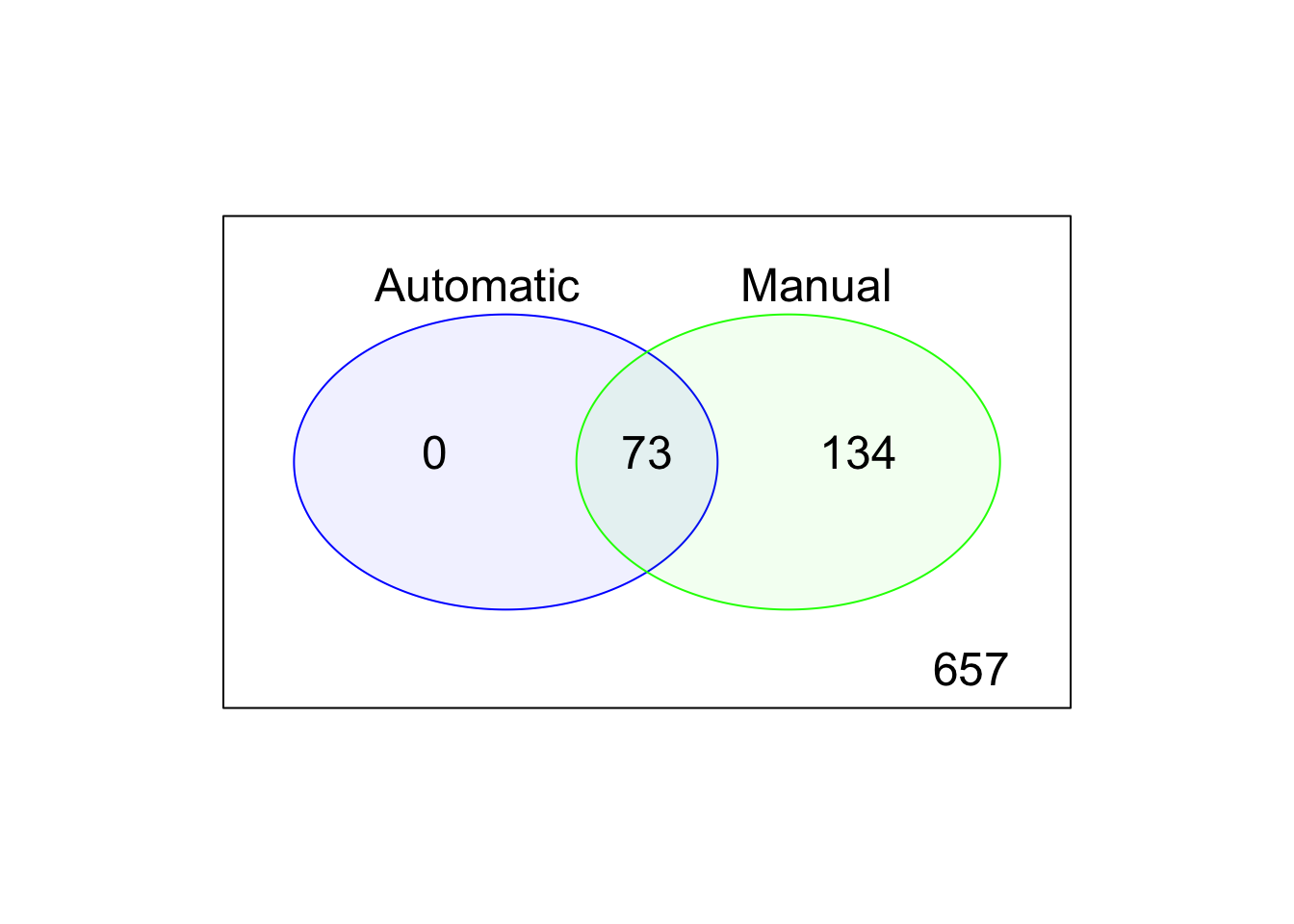
Figure 5.5: Comparison of the default, automatic and manual cell filters
5.1.6 Gene analysis
5.1.6.1 Gene expression
In addition to removing cells with poor quality, it is usually a good idea to exclude genes where we suspect that technical artefacts may have skewed the results. Moreover, inspection of the gene expression profiles may provide insights about how the experimental procedures could be improved.
It is often instructive to consider a plot that shows the top 50 (by default) most-expressed features. Each row in the plot below corresponds to a gene, and each bar corresponds to the expression of a gene in a single cell. The circle indicates the median expression of each gene, with which genes are sorted. By default, “expression” is defined using the feature counts (if available), but other expression values can be used instead by changing exprs_values.
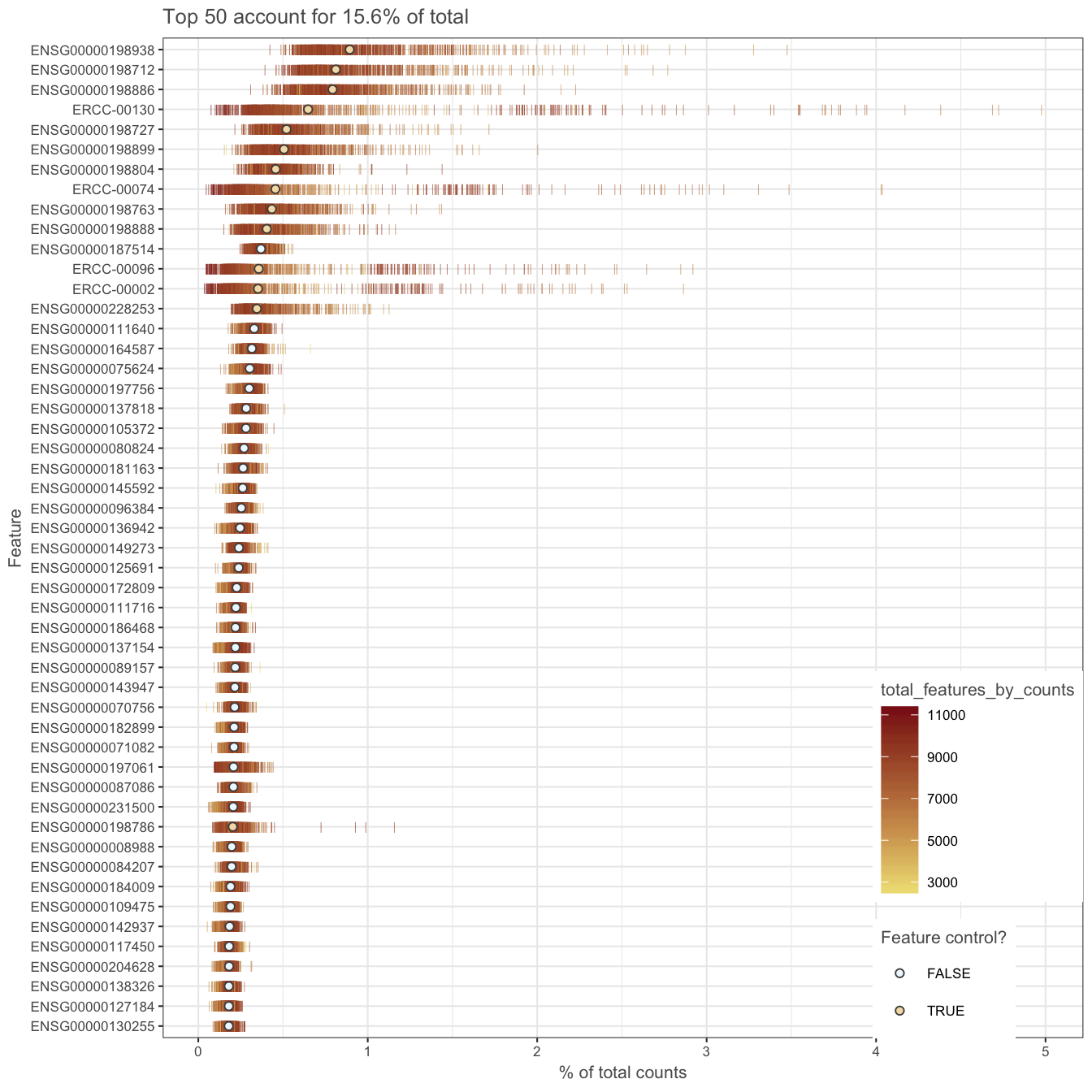
Figure 5.6: Number of total counts consumed by the top 50 expressed genes
A few spike-in transcripts may also be present here, though if all of the spike-ins are in the top 50, it suggests that too much spike-in RNA was added and a greater dilution of the spike-ins may be preferrable if the experiment is to be repeated. A large number of pseudo-genes or predicted genes may indicate problems with alignment.
5.1.6.2 Gene filtering
It is typically a good idea to remove genes whose expression level
is considered “undetectable”. We define a gene as detectable if
at least two cells contain more than 1 transcript from the gene. If
we were considering read counts rather than UMI counts a reasonable
threshold is to require at least five reads in at least two cells.
However, in both cases the threshold strongly depends on the
sequencing depth. It is important to keep in mind that genes must be
filtered after cell filtering since some genes may only be detected
in poor quality cells (__note__ colData(umi)$use filter applied
to the umi dataset).
In the example below, genes are only retained if they are expressed in two or more cells with more than 1 transcript:
keep_feature <- nexprs(umi[,colData(umi)$use], byrow=TRUE,
                       detection_limit=1) >= 2
rowData(umi)$use <- keep_feature## keep_feature
## FALSE TRUE
## 4660 14066Depending on the cell-type, protocol and sequencing depth, other cut-offs may be appropriate.
Before we leave this section, we can check the dimensions of the QCed dataset (do not forget about the gene filter we defined above):
## [1] 14066 657Let’s create an additional slot with log-transformed counts (we will need it in the next sections):
5.2 Data visualization
5.2.1 Introduction
In this section, we will continue to work with the filtered
Tung dataset produced in the previous section. We will explore
different ways of visualizing the data to allow you to asses
what happened to the expression matrix after the quality control
step. scater package provides several very useful functions
to simplify visualisation.
One important aspect of single-cell RNA-seq is to control for
batch effects. Batch effects are technical artefacts that are
added to the samples during handling. For example, if two sets
of samples were prepared in different labs or even on different
days in the same lab, then we may observe greater similarities
between the samples that were handled together. In the worst
case scenario, batch effects may be
mistaken
for true biological variation. The Tung data allows us to
explore these issues in a controlled manner since some of the
salient aspects of how the samples were handled have been
recorded. Ideally, we expect to see batches from the same
individual grouping together and distinct groups corresponding
to each individual.
5.2.2 PCA plot
The easiest way to overview the data is by transforming it using the principal component analysis and then visualize the first two principal components.
Principal component analysis (PCA) is a statistical procedure that uses a transformation to convert a set of observations into a set of values of linearly uncorrelated variables called principal components (PCs). The number of principal components is less than or equal to the number of original variables.
Mathematically, the PCs correspond to the eigenvectors of the covariance matrix. The eigenvectors are sorted by eigenvalue so that the first principal component accounts for as much of the variability in the data as possible, and each succeeding component in turn has the highest variance possible under the constraint that it is orthogonal to the preceding components (the figure below is taken from here).
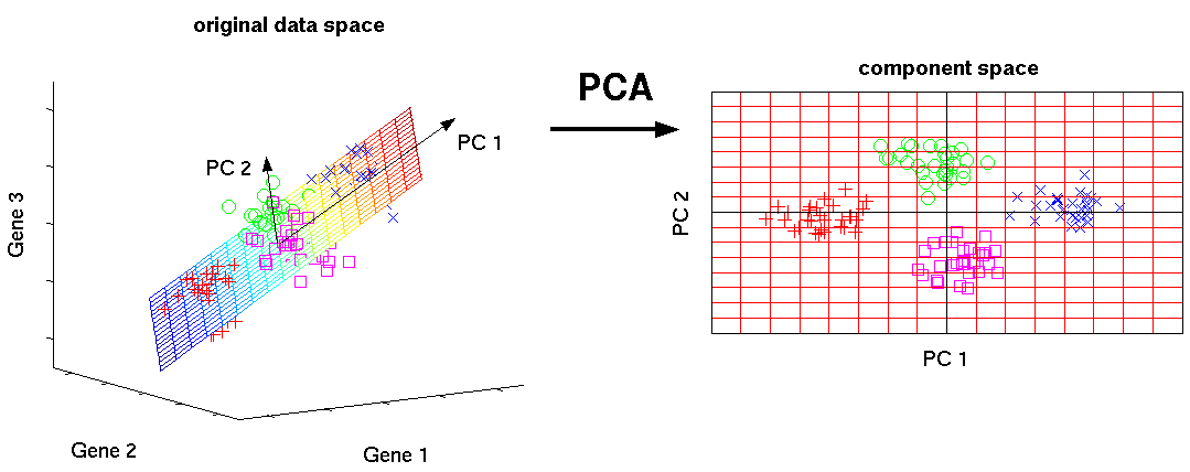
Figure 5.7: Schematic representation of PCA dimensionality reduction
5.2.2.1 Before QC
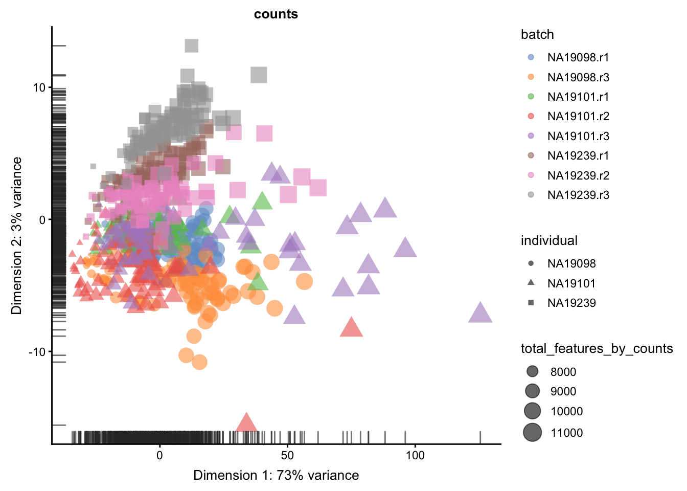
Without log-transformation:
plotPCA(
    umi[endog_genes, ],
    colour_by = "batch",
    size_by = "total_features_by_counts",
    shape_by = "individual",
run_args=list(exprs_values="counts")
)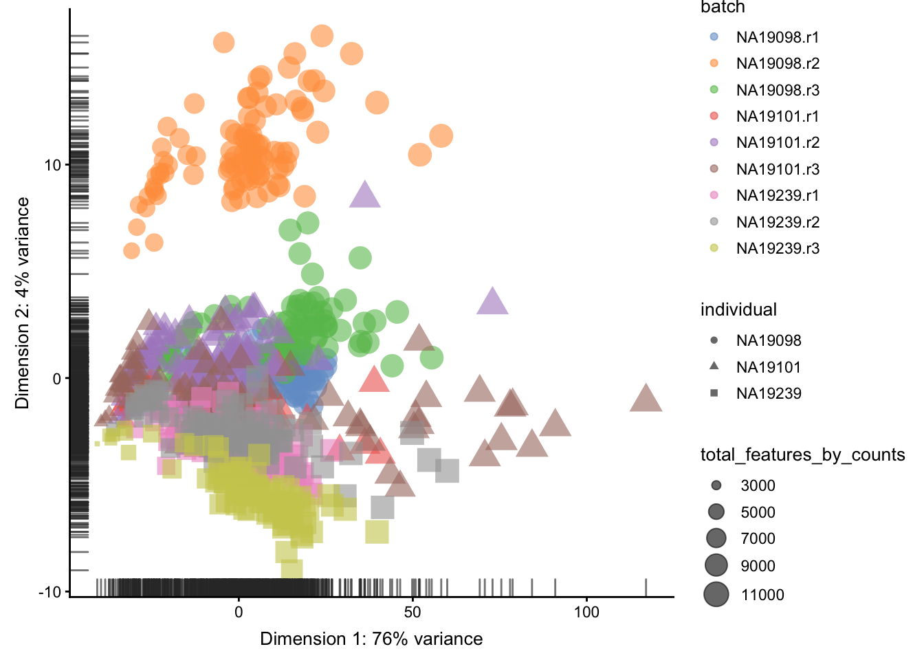
Figure 5.8: PCA plot of the tung data
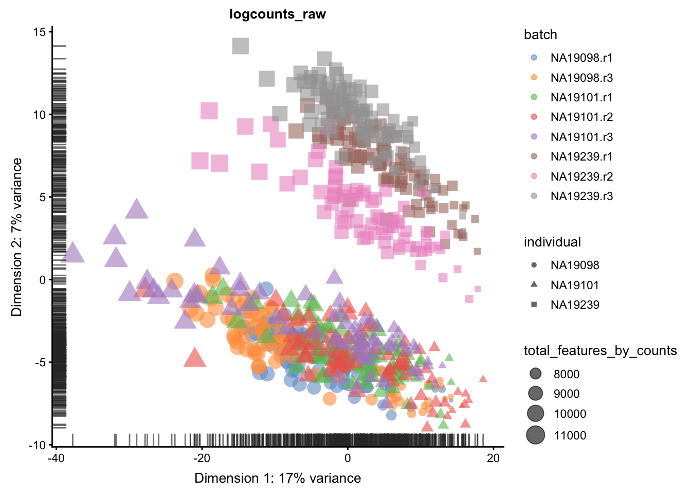
With log-transformation:
plotPCA(
    umi[endog_genes, ],
    colour_by = "batch",
    size_by = "total_features_by_counts",
    shape_by = "individual",
run_args=list(exprs_values="logcounts_raw")
)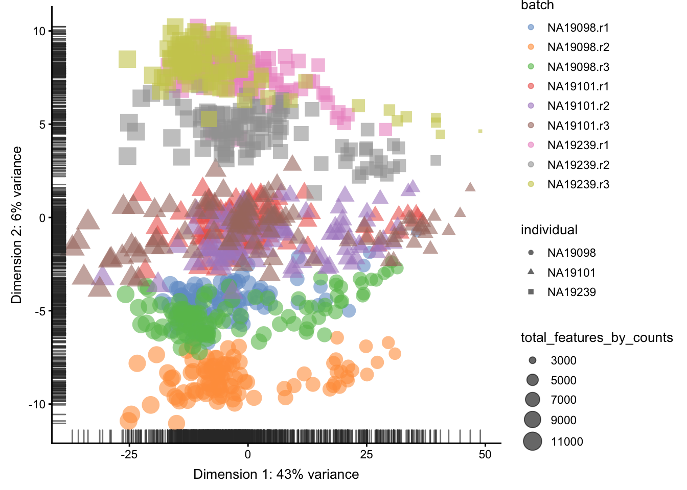
Figure 5.9: PCA plot of the tung data
Clearly log-transformation is benefitial for our data. It reduces the variance on the first principal component and already separates some biological effects. Moreover, it makes the distribution of the expression values more normal. In the following analysis and sections we will be using log-transformed raw counts by default.
However, note that just a log-transformation is not enough to account for different technical factors between the cells (e.g. sequencing depth). Therefore, please do not use logcounts_raw for your downstream analysis, instead as a minimum suitable data use the logcounts slot of the SingleCellExperiment object, which not just log-transformed, but also normalised by library size (e.g. CPM normalisation). For the moment, we use logcounts_raw only for demonstration purposes!
5.2.2.2 After QC
plotPCA(
    umi.qc[endog_genes, ],
    colour_by = "batch",
    size_by = "total_features_by_counts",
    shape_by = "individual",
    run_args=list(exprs_values="logcounts_raw")
)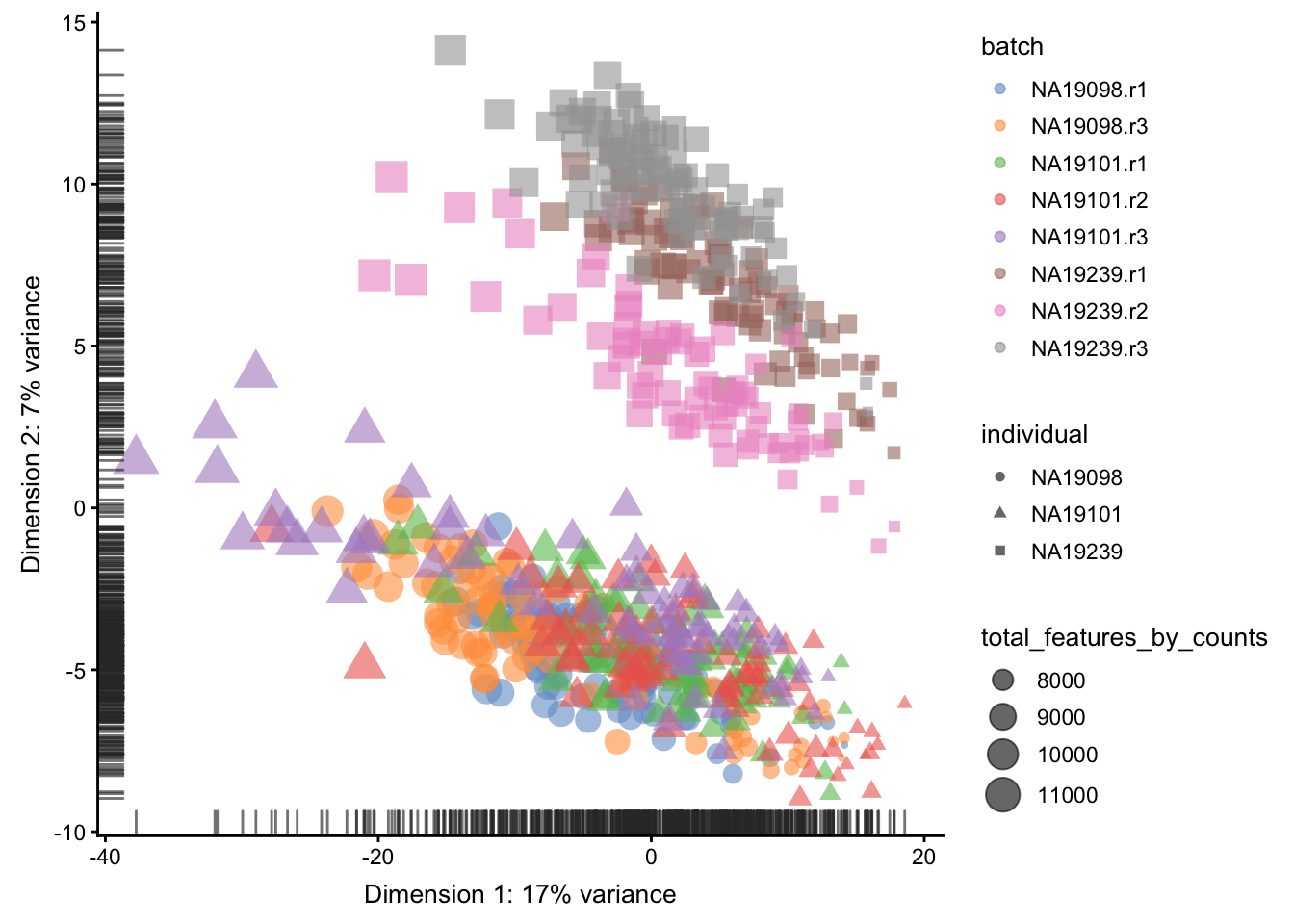
Figure 5.10: PCA plot of the tung data
Comparing Figure 5.9
and Figure 5.10, it is
clear that after quality control the NA19098.r2 cells
no longer form a group of outliers.
By default only the top 500 most variable genes are used
by scater to calculate the PCA. This can be adjusted by
changing the ntop argument.
5.2.3 tSNE map
An alternative to PCA for visualizing scRNASeq data is a tSNE plot. tSNE (t-Distributed Stochastic Neighbor Embedding) combines dimensionality reduction (e.g. PCA) with random walks on the nearest-neighbour network to map high dimensional data (i.e. our 14,214 dimensional expression matrix) to a 2-Dimensional space while preserving local distances between cells. In contrast with PCA, tSNE is a stochastic algorithm which means running the method multiple times on the same dataset will result in different plots. Due to the non-linear and stochastic nature of the algorithm, tSNE is more difficult to intuitively interpret tSNE. To ensure reproducibility, we fix the “seed” of the random-number generator in the code below so that we always get the same plot.
5.2.3.1 Before QC
set.seed(123456)
plotTSNE(
    umi[endog_genes, ],
    colour_by = "batch",
    size_by = "total_features_by_counts",
    shape_by = "individual",
    run_args=list(exprs_values="logcounts_raw",
                  perplexity = 130)
)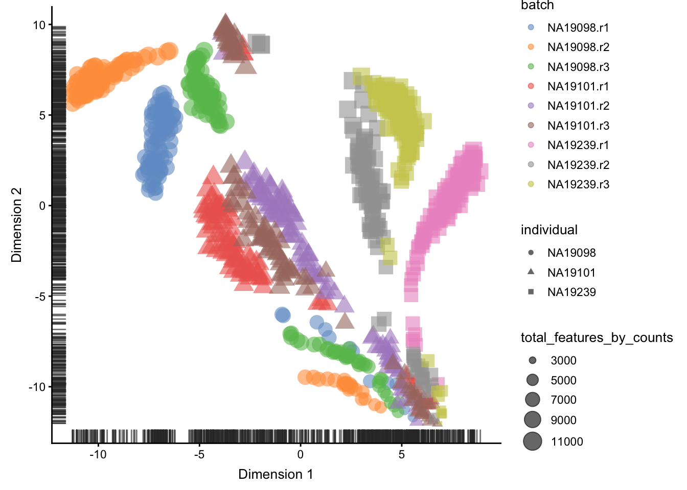
Figure 5.11: tSNE map of the tung data
5.2.3.2 After QC
set.seed(123456)
plotTSNE(
    umi.qc[endog_genes, ],
    colour_by = "batch",
    size_by = "total_features_by_counts",
    shape_by = "individual",
    run_args=list(exprs_values="logcounts_raw",
                  perplexity = 130)
)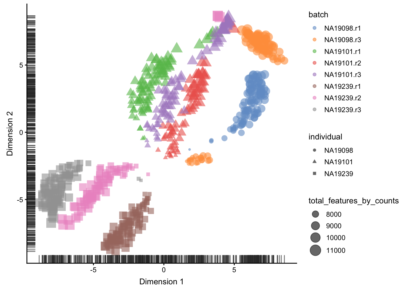
Figure 5.12: tSNE map of the tung data
Interpreting PCA and tSNE plots is often challenging
and due to their stochastic and non-linear nature,
they are less intuitive. However, in this case it is
clear that they provide a similar picture of the data.
Comparing Figure 5.11
and 5.12, it is again
clear that the samples from NA19098.r2 are no longer
outliers after the QC filtering.
Furthermore tSNE requires you to provide a value of
perplexity which reflects the number of neighbours used
to build the nearest-neighbour network; a high value
creates a dense network which clumps cells together
while a low value makes the network more sparse allowing
groups of cells to separate from each other. scater
uses a default perplexity of the total number of cells
divided by five (rounded down).
You can read more about the pitfalls of using tSNE here.
As an exercise, I will leave it up to you explore how the tSNE plots change when a perplexity of 10 or 200 is used. How does the choice of perplexity affect the interpretation of the results?
5.3 Identifying confounding factors
5.3.1 Introduction
There is a large number of potential confounders, artifacts
and biases in sc-RNA-seq data. One of the main challenges in
analyzing scRNA-seq data stems from the fact that it is
difficult to carry out a true technical replicate (why?)
to distinguish biological and technical variability. In
the previous sections we considered batch effects and in
this section we will continue to explore how experimental
artifacts can be identified and removed. We will continue
using the scater package since it provides a set of methods
specifically for quality control of experimental and
explanatory variables. Moreover, we will continue to work with
the Blischak data that was used in the previous section.
Recall that the umi.qc dataset contains filtered cells and
genes. Our next step is to explore technical drivers of
variability in the data to inform data normalisation before
downstream analysis.
5.3.2 Correlations with PCs
Let’s first look again at the PCA plot of the QCed dataset:
plotPCA(
    umi.qc[endog_genes, ],
    colour_by = "batch",
    size_by = "total_features_by_counts",
    run_args=list(exprs_values="logcounts_raw")
)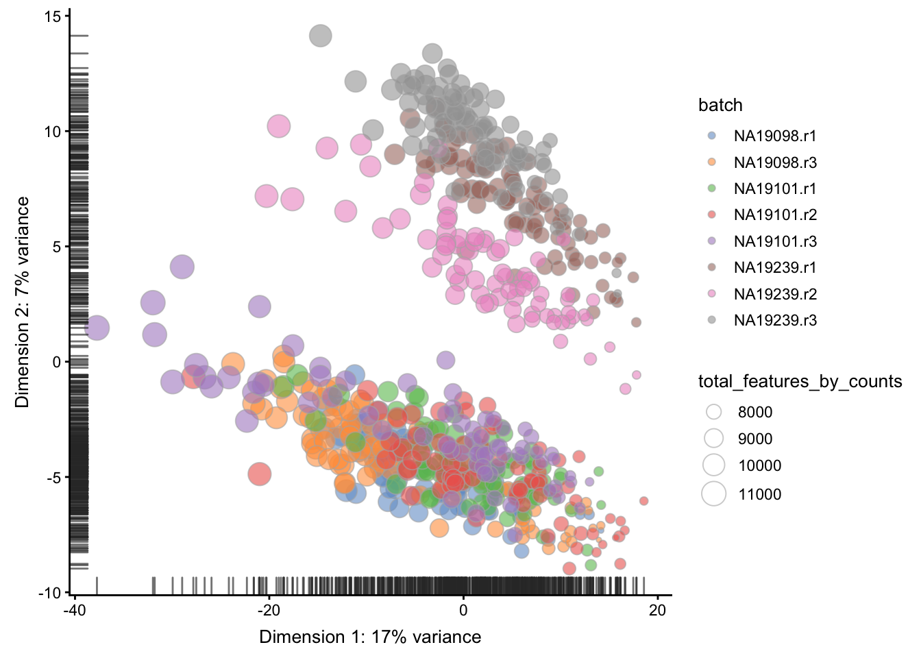
Figure 5.13: PCA plot of the tung data
scater allows one to identify principal components
that correlate with experimental and QC variables of
interest (it ranks principle components by \(R^2\) from
a linear model regressing PC value against the
variable of interest).
Let’s test whether some of the variables correlate with any of the PCs.
5.3.2.1 Detected genes
plotExplanatoryPCs(
    umi.qc[endog_genes, ],
    variables = "total_features_by_counts",
    exprs_values="logcounts_raw")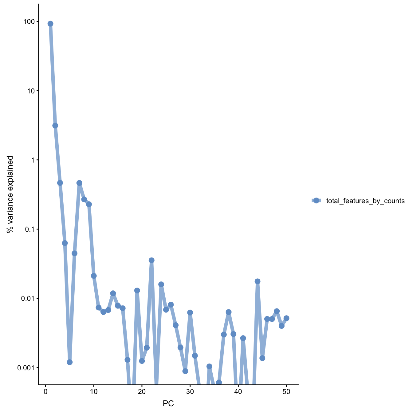
Figure 5.14: PC correlation with the number of detected genes
Indeed, we can see that PC1 can be almost completely
explained by the number of detected genes. In fact,
it was also visible on the PCA plot above. This is a
well-known issue in scRNA-seq and was described
(Hicks et al. 2018) or here.
5.3.3 Explanatory variables
scater can also compute the marginal \(R^2\) for each
variable when fitting a linear model regressing
expression values for each gene against just that
variable, and display a density plot of the gene-wise
marginal \(R^2\) values for the variables.
plotExplanatoryVariables(
    umi.qc[endog_genes, ],
      variables = c(
        "total_features_by_counts",
        "total_counts",
        "batch",
        "individual",
        "pct_counts_ERCC",
        "pct_counts_MT"
    ),
    exprs_values="logcounts_raw")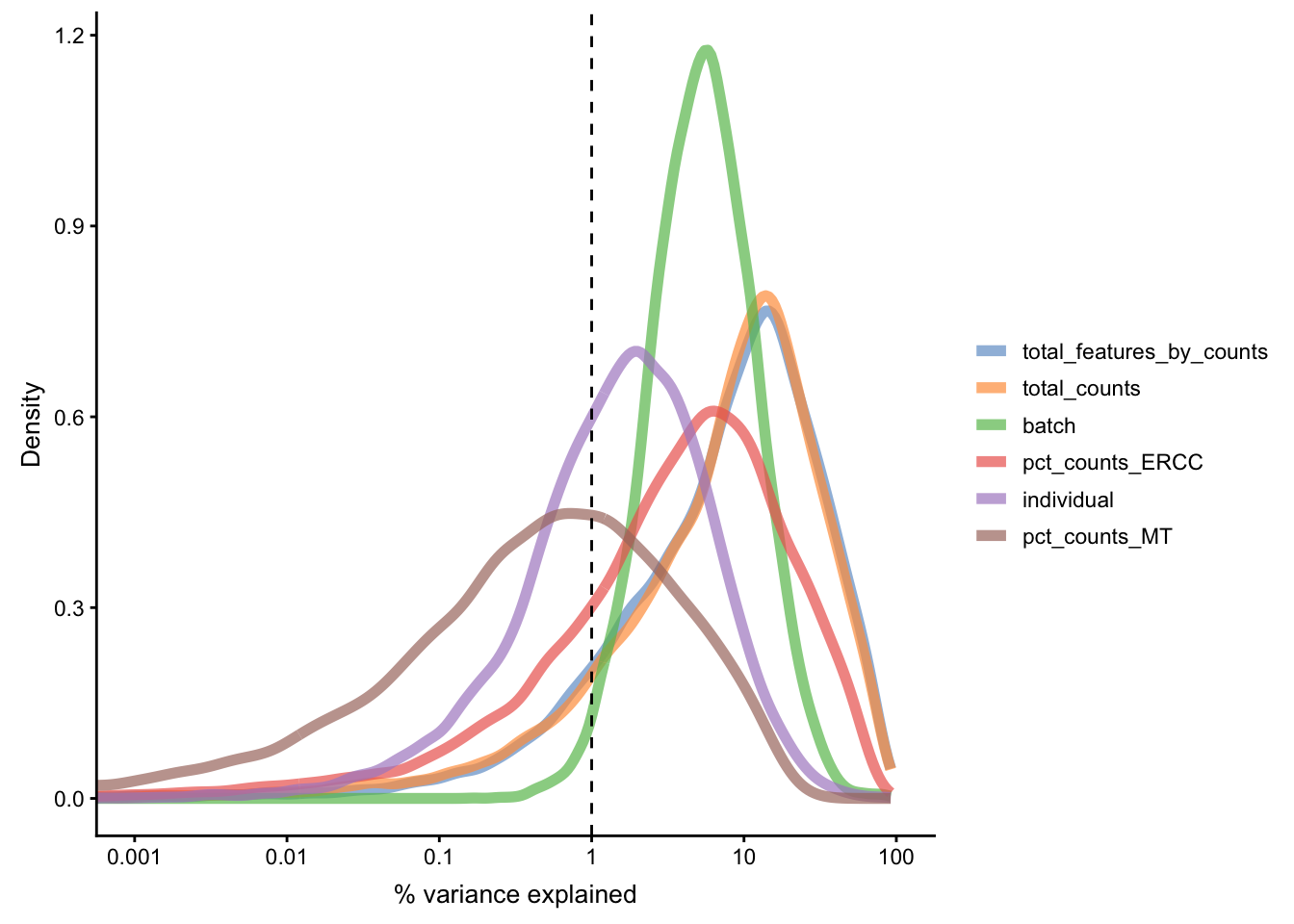
Figure 5.15: Explanatory variables
This analysis indicates that the number of detected genes (again) and also the sequencing depth (number of counts) have substantial explanatory power for many genes, so these variables are good candidates for conditioning out in a normalisation step, or including in downstream statistical models. Expression of ERCCs also appears to be an important explanatory variable and one notable feature of the above plot is that batch explains more than individual.
5.4 Normalization theory
5.4.1 Introduction
In the previous section, we identified important confounding
factors and explanatory variables. scater allows one to
account for these variables in subsequent statistical models
or to condition them out using normaliseExprs(), if so desired.
This can be done by providing a design matrix to normaliseExprs().
We are not covering this topic here, but you can try to do it
yourself as an exercise.
Instead we will explore how simple size-factor normalisations correcting for library size can remove the effects of some of the confounders and explanatory variables.
5.4.2 Library size
Library sizes vary because scRNA-seq data is often
sequenced on highly multiplexed platforms the total
reads which are derived from each cell may differ substantially.
Some quantification methods
(eg. Cufflinks,
RSEM) incorporated
library size when determining gene expression estimates
thus do not require this normalization.
However, if another quantification method was used then library size must be corrected for by multiplying or dividing each column of the expression matrix by a “normalization factor” which is an estimate of the library size relative to the other cells. Many methods to correct for library size have been developed for bulk RNA-seq and can technically applied to scRNA-seq (eg. UQ, SF, CPM, RPKM, FPKM, TPM), but these are not advised in practice. However, we will discuss them for completeness.
5.4.3 Normalisations
5.4.3.1 CPM
The simplest way to normalize this data is to convert it
to counts per million (__CPM__) by dividing each column by
its total then multiplying by 1,000,000. Note that spike-ins
should be excluded from the calculation of total expression
in order to correct for total cell RNA content, therefore we
will only use endogenous genes.
Example of a CPM function in R:
calc_cpm <-
function (expr_mat, spikes = NULL)
{
    norm_factor <- colSums(expr_mat[-spikes, ])
    return(t(t(expr_mat)/norm_factor)) * 10^6
}
One potential drawback of CPM is if your sample contains genes that are both very highly expressed and differentially expressed across the cells. In this case, the total molecules in the cell may depend of whether such genes are on/off in the cell and normalizing by total molecules may hide the differential expression of those genes and/or falsely create differential expression for the remaining genes.
Note RPKM, FPKM and TPM are variants on CPM which further adjust counts by the length of the respective gene/transcript.
To deal with this potentiality several other measures were devised.
5.4.3.2 RLE (SF)
The size factor (SF) was proposed and popularized by
DESeq (Anders and Huber 2010). First the geometric mean of each gene
across all cells is calculated. The size factor for each cell
is the median across genes of the ratio of the expression to
the gene’s geometric mean. A drawback to this method is that
since it uses the geometric mean only genes with non-zero
expression values across all cells can be used in its
calculation, making it unadvisable for large low-depth
scRNASeq experiments. edgeR & scater call this method
RLE for “relative log expression”. Example of a SF
function in R:
5.4.3.3 UQ
The upperquartile (UQ) was proposed by (Bullard et al. 2010).
Here each column is divided by the 75% quantile of the counts
for each library. Often the calculated quantile is scaled by
the median across cells to keep the absolute level of expression
relatively consistent. A drawback to this method is that for
low-depth scRNASeq experiments the large number of undetected
genes may result in the 75% quantile being zero (or close to it).
This limitation can be overcome by generalizing the idea and
using a higher quantile (eg. the 99% quantile is the default
in scater) or by excluding zeros prior to calculating the 75%
quantile. Example of a UQ function in R:
5.4.3.4 TMM
Another method is called TMM is the weighted trimmed mean of M-values (to the reference) proposed by (Robinson and Oshlack 2010). The M-values in question are the gene-wise log2 fold changes between individual cells. One cell is used as the reference then the M-values for each other cell is calculated compared to this reference. These values are then trimmed by removing the top and bottom ~30%, and the average of the remaining values is calculated by weighting them to account for the effect of the log scale on variance. Each non-reference cell is multiplied by the calculated factor. Two potential issues with this method are insufficient non-zero genes left after trimming, and the assumption that most genes are not differentially expressed.
5.4.3.5 scran
scran package implements a variant on CPM specialized
for single-cell data (L. Lun, Bach, and Marioni 2016). Briefly this method
deals with the problem of vary large numbers of zero values
per cell by pooling cells together calculating a normalization
factor (similar to CPM) for the sum of each pool. Since
each cell is found in many different pools, cell-specific
factors can be deconvoluted from the collection of pool-specific
factors using linear algebra.
5.4.3.6 Downsampling
A final way to correct for library size is to downsample the
expression matrix so that each cell has approximately the
same total number of molecules. The benefit of this method
is that zero values will be introduced by the down sampling
thus eliminating any biases due to differing numbers of detected
genes. However, the major drawback is that the process is not
deterministic so each time the downsampling is run the resulting
expression matrix is slightly different. Thus, often analyses
must be run on multiple downsamplings to ensure results are
robust. Example of a downsampling function in R:
5.4.4 Effectiveness
To compare the efficiency of different normalization methods
we will use visual inspection of PCA plots and calculation
of cell-wise relative log expression via scater’s plotRLE()
function. Namely, cells with many (few) reads have higher (lower)
than median expression for most genes resulting in a positive
(negative) RLE across the cell, whereas normalized cells have
an RLE close to zero. Example of a RLE function in R:
calc_cell_RLE <-
function (expr_mat, spikes = NULL)
{
    RLE_gene <- function(x) {
        if (median(unlist(x)) > 0) {
            log((x + 1)/(median(unlist(x)) + 1))/log(2)
        }
        else {
            rep(NA, times = length(x))
        }
    }
    if (!is.null(spikes)) {
        RLE_matrix <- t(apply(expr_mat[-spikes, ], 1, RLE_gene))
    }
    else {
        RLE_matrix <- t(apply(expr_mat, 1, RLE_gene))
    }
    cell_RLE <- apply(RLE_matrix, 2, median, na.rm = T)
    return(cell_RLE)
}
Note The RLE, TMM, and UQ size-factor methods were developed for bulk RNA-seq data and, depending on the experimental context, may not be appropriate for single-cell RNA-seq data, as their underlying assumptions may be problematically violated. Therefore, will not apply them here.
Note scater acts as a wrapper for the calcNormFactors()
function from edgeR which implements several library size
normalization methods making it easy to apply any of these
methods to our data.
Note edgeR makes extra adjustments to some of the
normalization methods which may result in somewhat different
results than if the original methods are followed exactly,
e.g. edgeR’s and scater’s “RLE” method which is based on
the “size factor” used by DESeq
may give different results to the estimateSizeFactorsForMatrix()
method in the DESeq/DESeq2 packages. In addition, some
versions of edgeR will not calculate the normalization
factors correctly unless lib.size is set at 1 for all cells.
Note For CPM normalisation we use scater’s
calculateCPM() function. For scran
we use scran package to calculate size factors (it also
operates on SingleCellExperiment class) and scater’s
normalize() to normalise the data. All these normalization
functions save the results to the logcounts slot of the
SCE object.
5.5 Normalization practice
We will continue to work with the Tung data that was used
in the previous section.
5.5.1 Raw
plotPCA(
    umi.qc[endog_genes, ],
    colour_by = "batch",
    size_by = "total_features_by_counts",
    shape_by = "individual",
    run_args=list(exprs_values="logcounts_raw")
)
Figure 5.16: PCA plot of the tung data
Relative log expression (RLE) plots are a powerful tool for visualizing unwanted variation in high-dimensional data. These plots were originally devised for gene expression data from microarrays but can also be used on single-cell expression data. RLE plots are particularly useful for assessing whether a procedure aimed at removing unwanted variation (e.g., scaling normalization) has been successful.
Here, we use the plotRLE() function in scater:
plotRLE(
    umi.qc[endog_genes, ],
    exprs_values = "logcounts_raw",
    exprs_logged = TRUE,
    colour_by = "batch"
) + ggtitle("Raw or no normalization") + ylim(-4,4)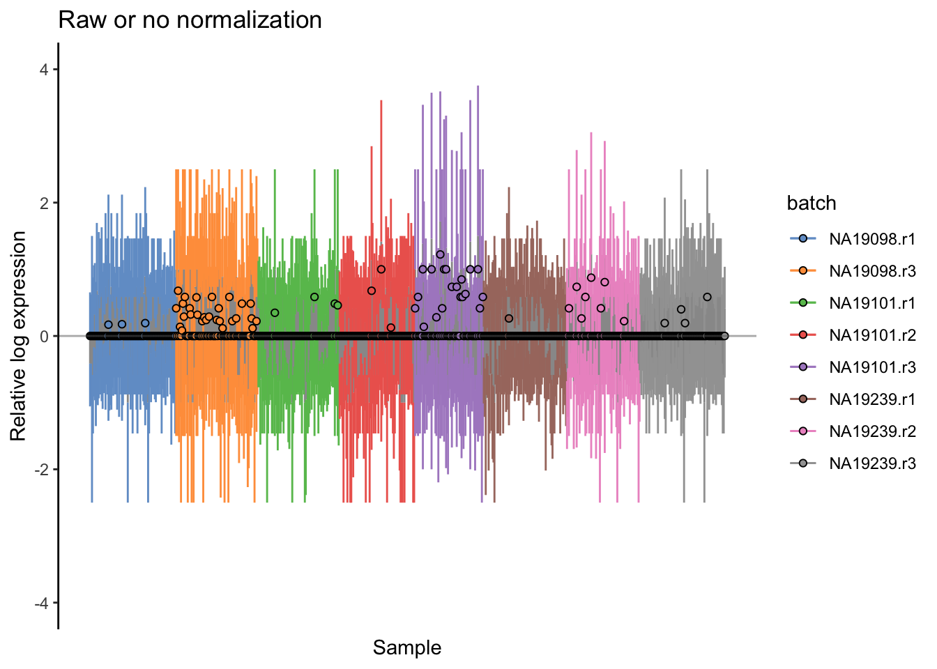
5.5.2 CPM
logcounts(umi.qc) <- log2(calculateCPM(umi.qc, exprs_values = "counts",
                                       use_size_factors = FALSE) + 1)
plotPCA(
    umi.qc[endog_genes, ],
    colour_by = "batch",
    size_by = "total_features_by_counts",
    shape_by = "individual",
    run_args = list(exprs_values="logcounts")
)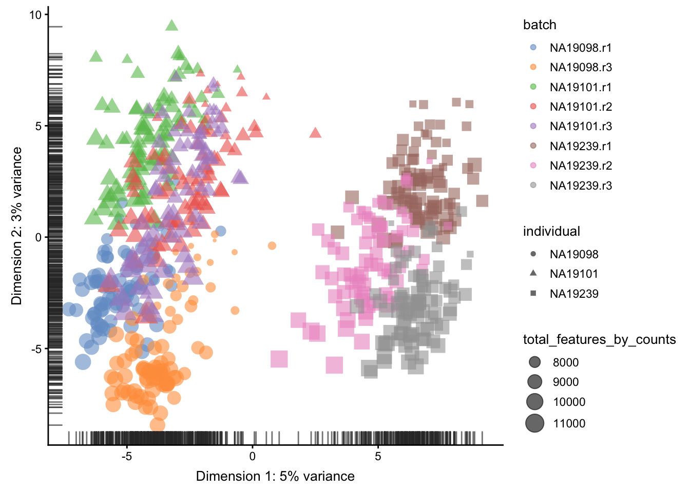
Figure 5.17: PCA plot of the tung data after CPM normalisation
plotRLE(
    umi.qc[endog_genes, ],
    exprs_values = "logcounts",
    exprs_logged = TRUE,
    colour_by = "batch") +
  ggtitle("After CPM normalization") + ylim(-4,4)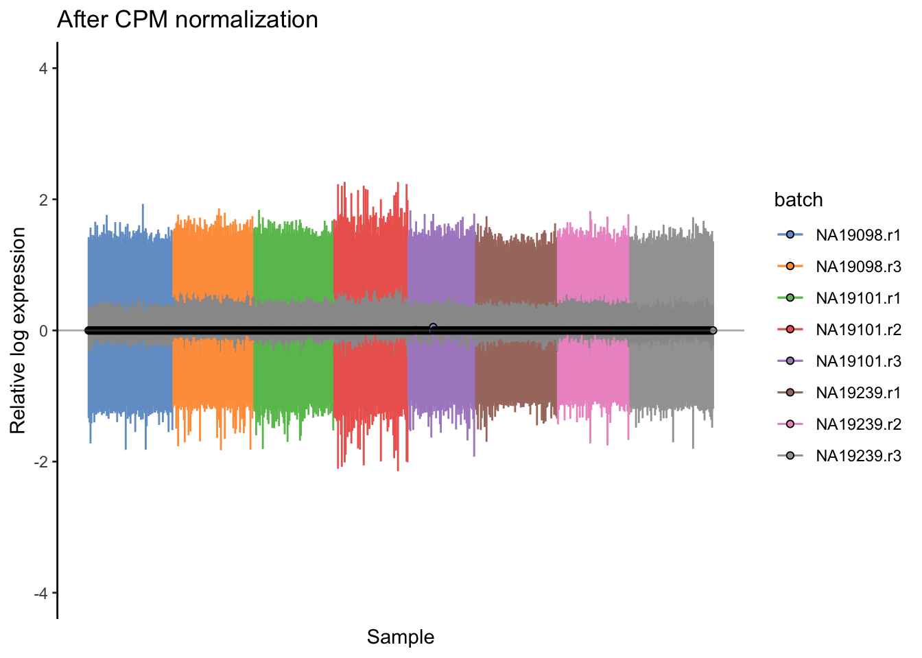
Figure 5.18: Cell-wise RLE of the tung data
5.5.3 scran
A normalization method developed specifically for scRNA-seq
data is in the scran R/Bioconductor package from
Lun et al. (2018).
Because there are so many zeros in scRNA-seq data, calculating scaling factors for each cell is not straightforward. The idea is to sum expression values across pools of cells, and the summed values are used for normalization. Pool-based size factors are then deconvolved to yield cell-based factors.
This approach (and others that have been developed specifically for scRNA-seq) has been shown to be more accurate than methods developed for bulk RNA-seq. These normalization approaches improve the results for downstream analyses.
library(scran)
qclust <- quickCluster(umi.qc, min.size = 30)
umi.qc <- computeSumFactors(umi.qc, sizes = 15, clusters = qclust)
umi.qc <- normalize(umi.qc)
plotPCA(
    umi.qc[endog_genes, ],
    colour_by = "batch",
    size_by = "total_features_by_counts",
    shape_by = "individual"
)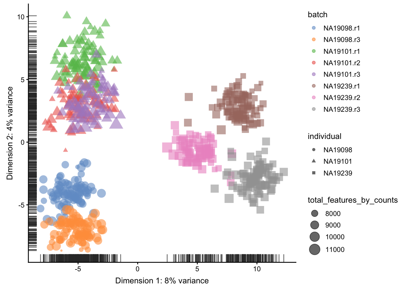
Figure 5.19: PCA plot of the tung data after LSF normalisation
plotRLE(
    umi.qc[endog_genes, ],
    exprs_values = "logcounts",
    exprs_logged = TRUE,
    colour_by = "batch"
) + ggtitle("After scran normalization") + ylim(-4,4)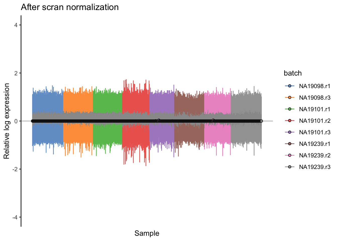
Figure 5.20: Cell-wise RLE of the tung data
Note: scran sometimes calculates negative or zero size factors.
These will completely distort the normalized expression matrix.
We can check the size factors scran has computed like so:
##    Min. 1st Qu.  Median    Mean 3rd Qu.    Max.
##  0.4671  0.7787  0.9483  1.0000  1.1525  3.1910
For this dataset all the size factors are reasonable so we
are done. If you find scran has calculated negative size
factors try increasing the cluster and pool sizes until
they are all positive.
5.6 Dealing with confounders
5.6.1 Introduction
In the previous section we normalized for library size, effectively removing it as a confounder. Now we will consider removing other less well defined confounders from our data. Technical confounders (aka batch effects) can arise from difference in reagents, isolation methods, the lab/experimenter who performed the experiment, even which day/time the experiment was performed. Accounting for technical confounders, and batch effects particularly, is a large topic that also involves principles of experimental design. Here we address approaches that can be taken to account for confounders when the experimental design is appropriate.
Fundamentally, accounting for technical confounders involves identifying and, ideally, removing sources of variation in the expression data that are not related to (i.e. are confounding) the biological signal of interest. Various approaches exist, some of which use spike-in or housekeeping genes, and some of which use endogenous genes.
5.6.1.1 Advantages and disadvantages of using spike-ins to remove confounders
The use of spike-ins as control genes is appealing, since the same amount of ERCC (or other) spike-in was added to each cell in our experiment. In principle, all the variablity we observe for these genes is due to technical noise; whereas endogenous genes are affected by both technical noise and biological variability. Technical noise can be removed by fitting a model to the spike-ins and “substracting” this from the endogenous genes. There are several methods available based on this premise (eg. BASiCS, scLVM, RUVg); each using different noise models and different fitting procedures. Alternatively, one can identify genes which exhibit significant variation beyond technical noise (eg. Distance to median, Highly variable genes). However, there are issues with the use of spike-ins for normalisation (particularly ERCCs, derived from bacterial sequences), including that their variability can, for various reasons, actually be higher than that of endogenous genes.
Given the issues with using spike-ins, better results can often be obtained by using endogenous genes instead. Where we have a large number of endogenous genes that, on average, do not vary systematically between cells and where we expect technical effects to affect a large number of genes (a very common and reasonable assumption), then such methods (for example, the RUVs method) can perform well.
We explore both general approaches below.
Factors contributing to technical noise frequently appear as “batch effects” where cells processed on different days or by different technicians systematically vary from one another. Removing technical noise and correcting for batch effects can frequently be performed using the same tool or slight variants on it.
In the following subsections, we will consider ComBat, the use of generalized linear models (GLMs) and mnnCorrect.
5.6.2 Combat
If you have an experiment with a balanced design, Combat can be
used to eliminate batch effects while preserving biological effects
by specifying the biological effects using the mod parameter.
However the Tung data contains multiple experimental replicates
rather than a balanced design so using mod1 to preserve biological
variability will result in an error.
combat_data <- logcounts(umi.qc)
mod_data <- as.data.frame(t(combat_data))
# Basic batch removal
mod0 = model.matrix(~ 1, data = mod_data)
# Preserve biological variability
mod1 = model.matrix(~ umi.qc$individual, data = mod_data)
# adjust for total genes detected
mod2 = model.matrix(~ umi.qc$total_features_by_counts, data = mod_data)
assay(umi.qc, "combat") <- ComBat(
    dat = t(mod_data),
    batch = factor(umi.qc$batch),
    mod = mod0,
    par.prior = TRUE,
    prior.plots = FALSE
)
## Standardizing Data across genesWe could also perform ComBat correction accounting for other covariates
such as total_features_by_counts as a co-variate.
Store the corrected matrix in the combat_tf slot.
## Standardizing Data across genes5.6.3 mnnCorrect
mnnCorrect (Haghverdi et al. 2017) assumes that each batch
shares at least one biological condition with each other
batch. Thus it works well for a variety of balanced
experimental designs. However, the Tung data contains
multiple replicates for each invidividual rather than balanced
batches, thus we will normalized each individual separately.
Note that this will remove batch effects between batches within
the same individual but not the batch effects between batches
in different individuals, due to the confounded experimental
design.
Thus we will merge a replicate from each individual to form three batches.
do_mnn <- function(data.qc) {
    batch1 <- logcounts(data.qc[, data.qc$replicate == "r1"])
    batch2 <- logcounts(data.qc[, data.qc$replicate == "r2"])
    batch3 <- logcounts(data.qc[, data.qc$replicate == "r3"])

    if (ncol(batch2) > 0) {
        x = mnnCorrect(
          batch1, batch2, batch3,
          k = 20,
          sigma = 0.1,
          cos.norm.in = TRUE,
          svd.dim = 2
        )
        res1 <- x$corrected[[1]]
        res2 <- x$corrected[[2]]
        res3 <- x$corrected[[3]]
        dimnames(res1) <- dimnames(batch1)
        dimnames(res2) <- dimnames(batch2)
        dimnames(res3) <- dimnames(batch3)
        return(cbind(res1, res2, res3))
    } else {
        x = mnnCorrect(
          batch1, batch3,
          k = 20,
          sigma = 0.1,
          cos.norm.in = TRUE,
          svd.dim = 2
        )
        res1 <- x$corrected[[1]]
        res3 <- x$corrected[[2]]
        dimnames(res1) <- dimnames(batch1)
        dimnames(res3) <- dimnames(batch3)
        return(cbind(res1, res3))
    }
}

indi1 <- do_mnn(umi.qc[, umi.qc$individual == "NA19098"])
indi2 <- do_mnn(umi.qc[, umi.qc$individual == "NA19101"])
indi3 <- do_mnn(umi.qc[, umi.qc$individual == "NA19239"])

assay(umi.qc, "mnn") <- cbind(indi1, indi2, indi3)

# For a balanced design:
#assay(umi.qc, "mnn") <- mnnCorrect(
#    list(B1 = logcounts(batch1), B2 = logcounts(batch2), B3 = logcounts(batch3)),
#    k = 20,
#    sigma = 0.1,
#    cos.norm = TRUE,
#    svd.dim = 2
#)
5.6.4 GLM
A general linear model is a simpler version of Combat.
It can correct for batches while preserving biological effects
if you have a balanced design. In a confounded/replicate
design biological effects will not be fit/preserved. Similar
to mnnCorrect we could remove batch effects from each
individual separately in order to preserve biological
(and technical) variance between individuals. For demonstation
purposes we will naively correct all cofounded batch effects:
glm_fun <- function(g, batch, indi) {
  model <- glm(g ~ batch + indi)
  model$coef[1] <- 0
  return(model$coef)
}
effects <- apply(
    logcounts(umi.qc),
    1,
    glm_fun,
    batch = umi.qc$batch,
    indi = umi.qc$individual
)
corrected <- logcounts(umi.qc) - t(effects[as.numeric(factor(umi.qc$batch)), ])
assay(umi.qc, "glm") <- corrected
In contrast, we can also perform GLM correction for each
individual separately and store the final corrected
matrix in the glm_indi slot.
Let’s save the
5.6.5 How to evaluate and compare confounder removal strategies
A key question when considering the different methods for removing confounders is how to quantitatively determine which one is the most effective. The main reason why comparisons are challenging is because it is often difficult to know what corresponds to technical counfounders and what is interesting biological variability. Here, we consider three different metrics which are all reasonable based on our knowledge of the experimental design. Depending on the biological question that you wish to address, it is important to choose a metric that allows you to evaluate the confounders that are likely to be the biggest concern for the given situation.
5.6.5.1 Effectiveness 1
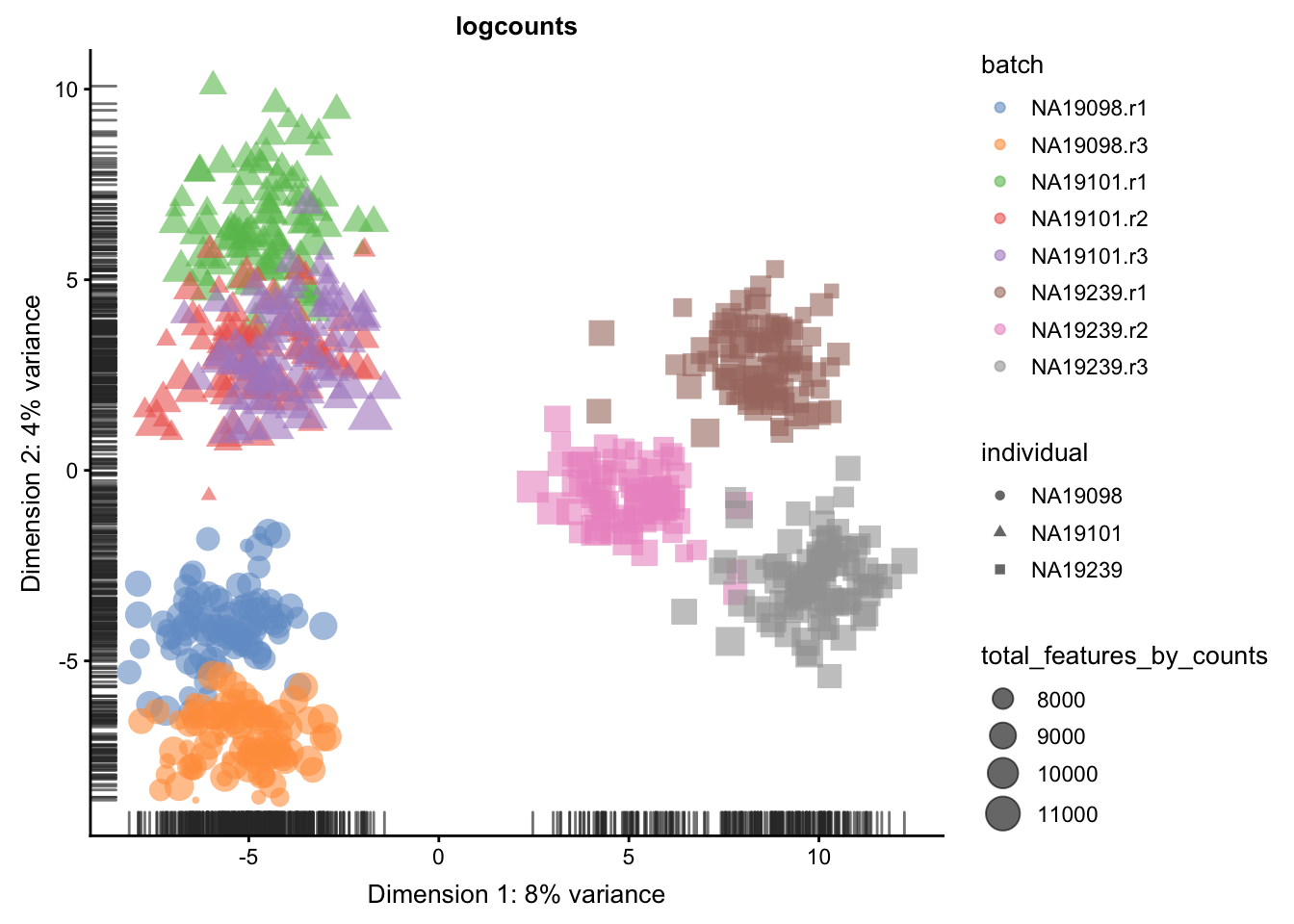
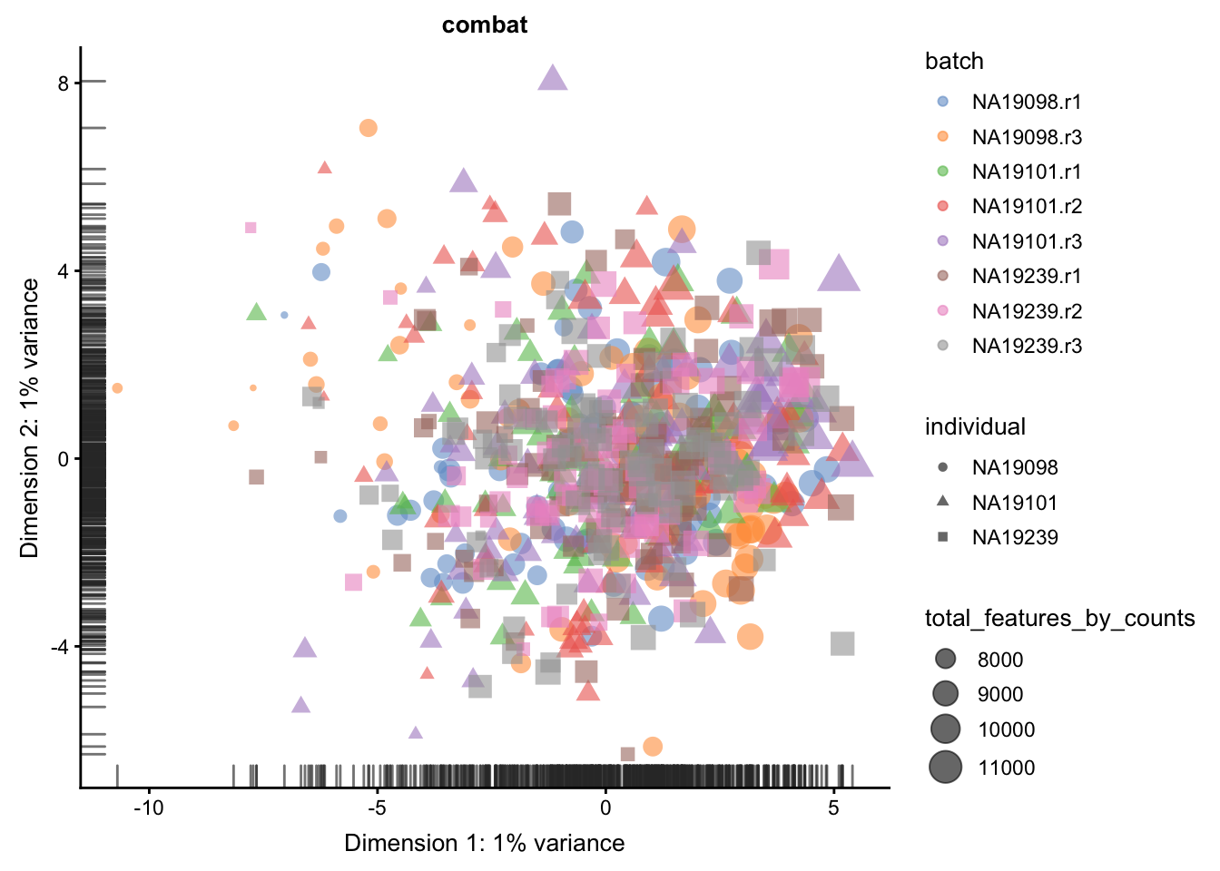
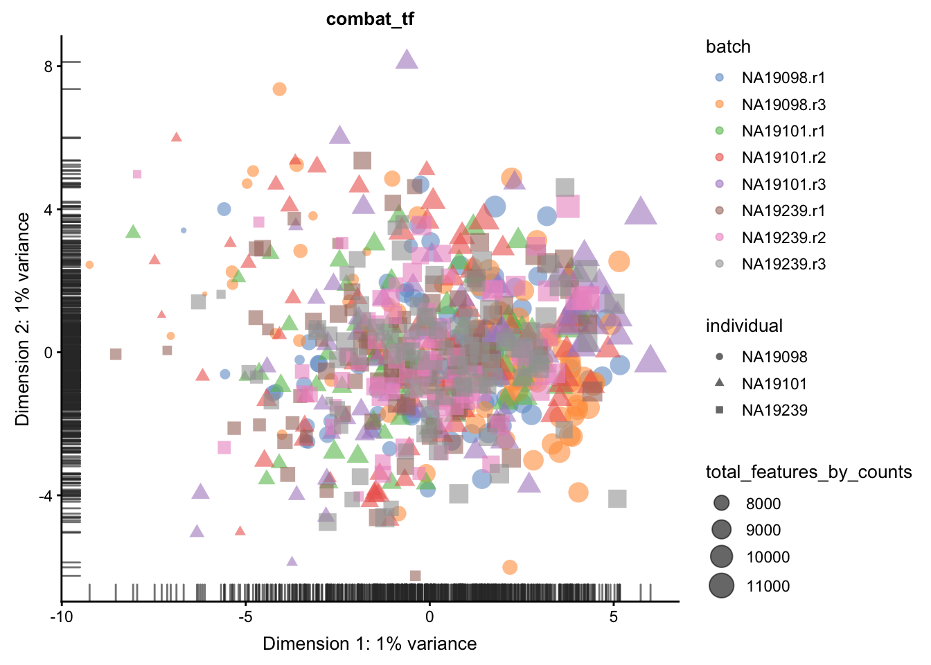
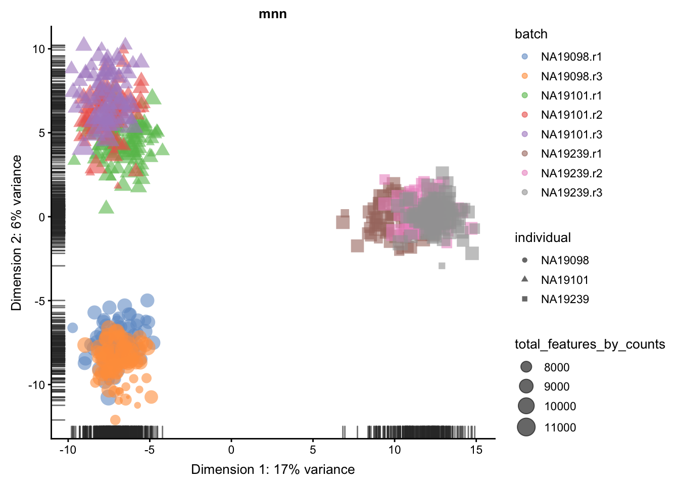
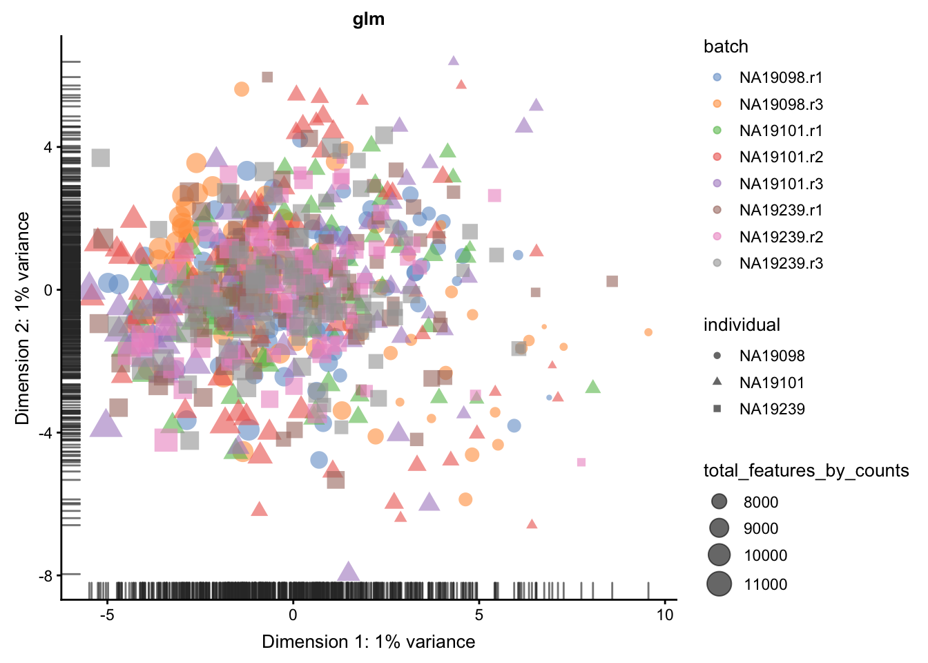
We evaluate the effectiveness of the normalization by inspecting the PCA plot where colour corresponds the technical replicates and shape corresponds to different biological samples (individuals). Separation of biological samples andinterspersed batches indicates that technical variation has beenremoved. We always use log2-cpm normalized data to match the assumptions of PCA.
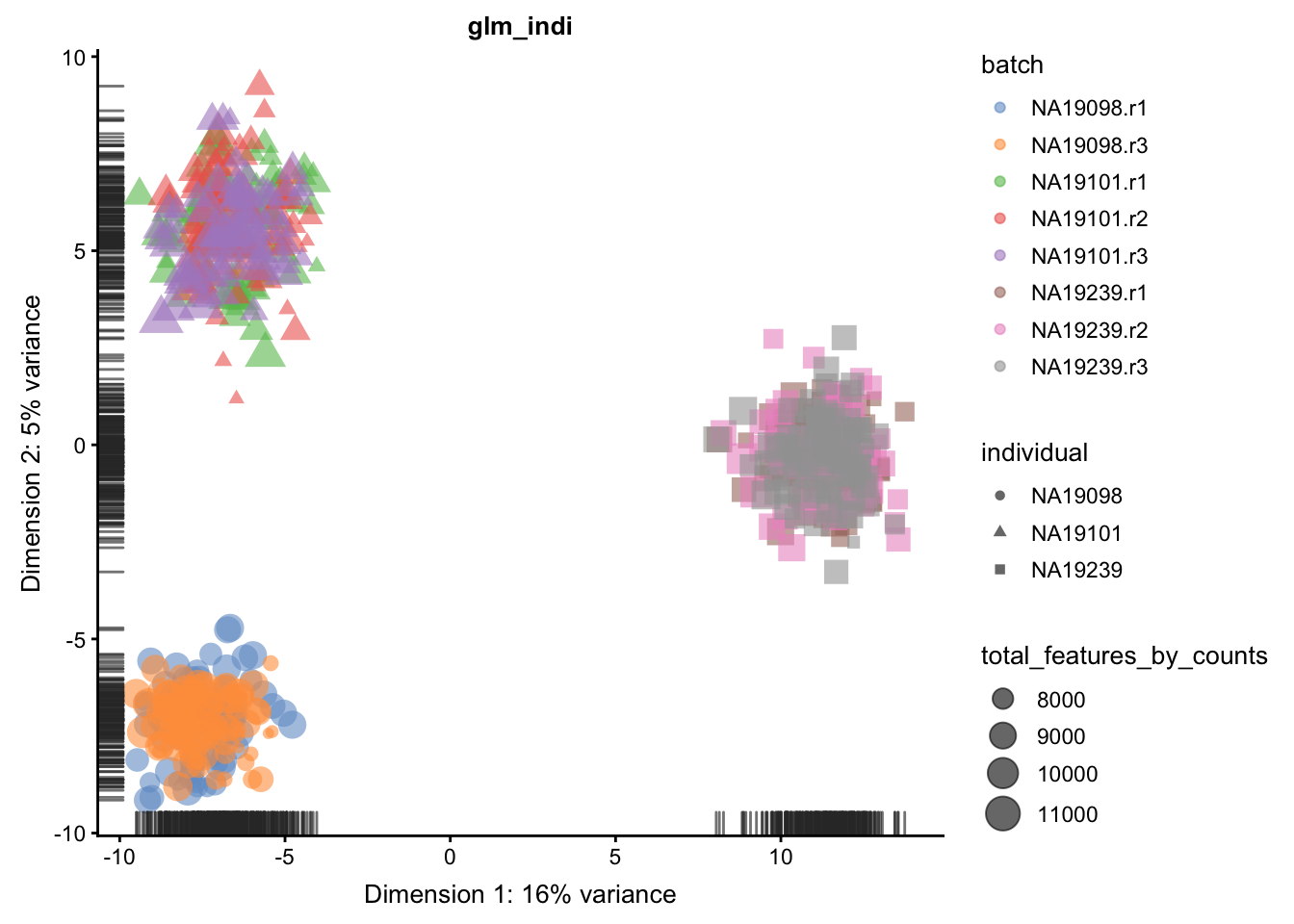
for(n in assayNames(umi.qc)) {
    print(
        plotPCA(
            umi.qc[endog_genes, ],
            colour_by = "batch",
            size_by = "total_features_by_counts",
            shape_by = "individual",
            run_args = list(exprs_values = n)
        ) +
        ggtitle(n)
    )
}
5.6.5.2 Effectiveness 2
We can repeat the analysis using the plotExplanatoryVariables()
to check whether batch effects have been removed.
for(n in assayNames(umi.qc)) {
    print(
        plotExplanatoryVariables(
            umi.qc[endog_genes, ],
            variables = c(
               "total_features_by_counts",
                "total_counts",
                "batch",
                "individual",
                "pct_counts_ERCC",
                "pct_counts_MT"
            ),
            exprs_values=n) +
        ggtitle(n)
    )
}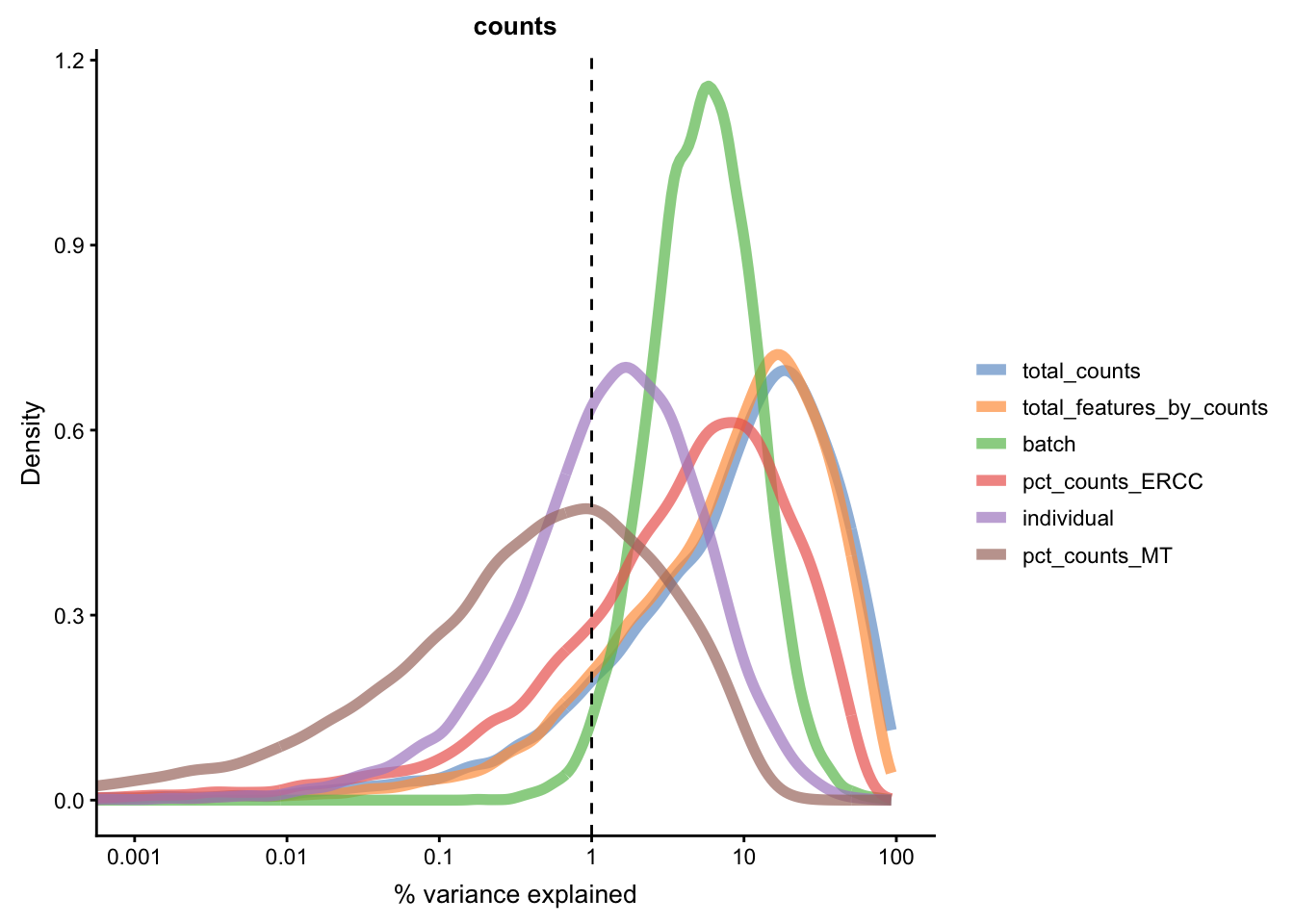
Figure 5.21: Explanatory variables (mnn)
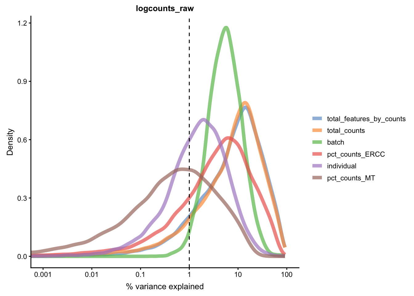
Figure 5.21: Explanatory variables (mnn)
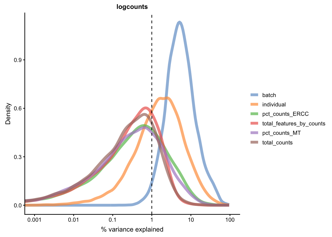
Figure 5.21: Explanatory variables (mnn)

Figure 5.21: Explanatory variables (mnn)
Figure 5.21: Explanatory variables (mnn)
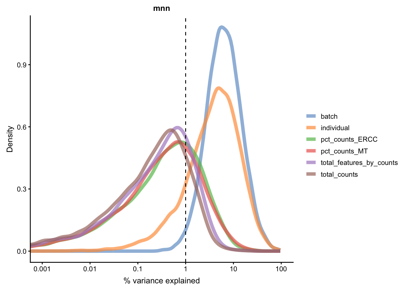
Figure 5.21: Explanatory variables (mnn)
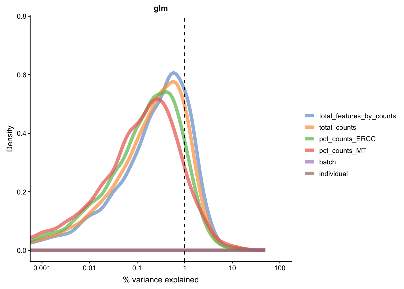
Figure 5.21: Explanatory variables (mnn)
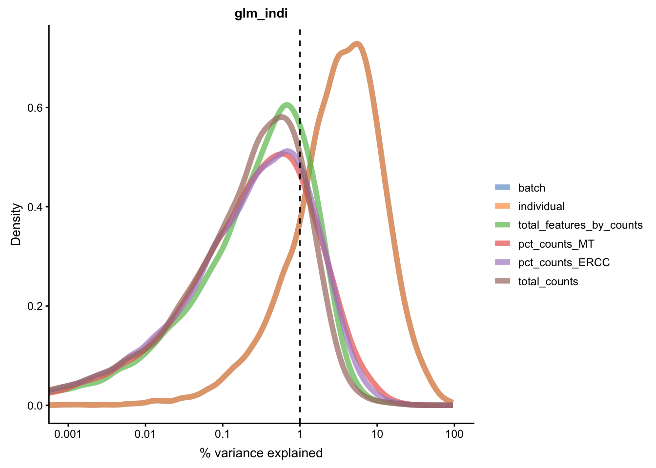
Figure 5.21: Explanatory variables (mnn)
5.6.5.3 Effectiveness 3
Another method to check the efficacy of batch-effect correction is to consider the intermingling of points from different batches in local subsamples of the data. If there are no batch-effects then proportion of cells from each batch in any local region should be equal to the global proportion of cells in each batch.
kBET (Buttner et al. 2017) takes kNN networks around random
cells and tests the number of cells from each batch against a
binomial distribution. The rejection rate of these tests
indicates the severity of batch-effects still present in the
data (high rejection rate = strong batch effects). kBET
assumes each batch contains the same complement of biological
groups, thus it can only be applied to the entire dataset if a
perfectly balanced design has been used. However, kBET can
also be applied to replicate-data if it is applied to each
biological group separately. In the case of the Tung data, we
will apply kBET to each individual independently to check for
residual batch effects. However, this method will not identify
residual batch-effects which are confounded with biological
conditions. In addition, kBET does not determine if biological
signal has been preserved.
compare_kBET_results <- function(sce){
    indiv <- unique(sce$individual)
    norms <- assayNames(sce) # Get all normalizations
    results <- list()
    for (i in indiv){
        for (j in norms){
            tmp <- kBET(
                df = t(assay(sce[,sce$individual== i], j)),
                batch = sce$batch[sce$individual==i],
                heuristic = TRUE,
                verbose = FALSE,
                addTest = FALSE,
                plot = FALSE)
            results[[i]][[j]] <- tmp$summary$kBET.observed[1]
        }
    }
    return(as.data.frame(results))
}

eff_debatching <- compare_kBET_results(umi.qc)library(reshape2)
library(RColorBrewer)
# Plot results
dod <- melt(as.matrix(eff_debatching), value.name = "kBET")
colnames(dod)[1:2] <- c("Normalisation", "Individual")
colorset <- c('gray', brewer.pal(n = 9, "RdYlBu"))
ggplot(dod, aes(Normalisation, Individual, fill=kBET)) +
geom_tile() +
scale_fill_gradient2(
na.value = "gray",
low = colorset[2],
mid=colorset[6],
high = colorset[10],
midpoint = 0.5, limit = c(0,1)) +
scale_x_discrete(expand = c(0, 0)) +
scale_y_discrete(expand = c(0, 0)) +
theme(
axis.text.x = element_text(
angle = 45,
vjust = 1,
size = 12,
hjust = 1
)
) +
ggtitle("Effect of batch regression methods per individual")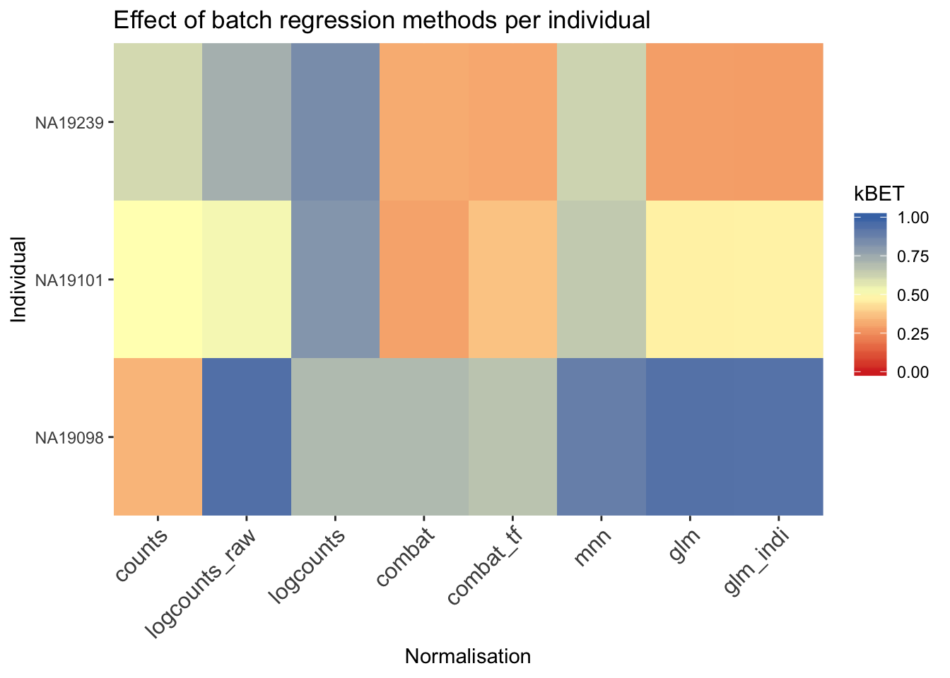
## Loading required package: SummarizedExperiment## Loading required package: GenomicRanges## Loading required package: stats4## Loading required package: BiocGenerics## Loading required package: parallel##
## Attaching package: 'BiocGenerics'## The following objects are masked from 'package:parallel':
##
## clusterApply, clusterApplyLB, clusterCall, clusterEvalQ,
## clusterExport, clusterMap, parApply, parCapply, parLapply,
## parLapplyLB, parRapply, parSapply, parSapplyLB## The following objects are masked from 'package:stats':
##
## IQR, mad, sd, var, xtabs## The following objects are masked from 'package:base':
##
## anyDuplicated, append, as.data.frame, basename, cbind,
## colMeans, colnames, colSums, dirname, do.call, duplicated,
## eval, evalq, Filter, Find, get, grep, grepl, intersect,
## is.unsorted, lapply, lengths, Map, mapply, match, mget, order,
## paste, pmax, pmax.int, pmin, pmin.int, Position, rank, rbind,
## Reduce, rowMeans, rownames, rowSums, sapply, setdiff, sort,
## table, tapply, union, unique, unsplit, which, which.max,
## which.min## Loading required package: S4Vectors##
## Attaching package: 'S4Vectors'## The following object is masked from 'package:base':
##
## expand.grid## Loading required package: IRanges## Loading required package: GenomeInfoDb## Loading required package: Biobase## Welcome to Bioconductor
##
## Vignettes contain introductory material; view with
## 'browseVignettes()'. To cite Bioconductor, see
## 'citation("Biobase")', and for packages 'citation("pkgname")'.## Loading required package: DelayedArray## Loading required package: matrixStats##
## Attaching package: 'matrixStats'## The following objects are masked from 'package:Biobase':
##
## anyMissing, rowMedians## Loading required package: BiocParallel##
## Attaching package: 'DelayedArray'## The following objects are masked from 'package:matrixStats':
##
## colMaxs, colMins, colRanges, rowMaxs, rowMins, rowRanges## The following objects are masked from 'package:base':
##
## aperm, apply## Loading required package: ggplot2##
## Attaching package: 'scater'## The following object is masked from 'package:S4Vectors':
##
## rename## The following object is masked from 'package:stats':
##
## filterReferences
Tung, Po-Yuan, John D. Blischak, Chiaowen Joyce Hsiao, David A. Knowles, Jonathan E. Burnett, Jonathan K. Pritchard, and Yoav Gilad. 2017. “Batch Effects and the Effective Design of Single-Cell Gene Expression Studies.” Sci. Rep. 7 (January): 39921. https://doi.org/10.1038/srep39921.
Hicks, Stephanie C, F William Townes, Mingxiang Teng, and Rafael A Irizarry. 2018. “Missing Data and Technical Variability in Single-Cell Rna-Sequencing Experiments.” Biostatistics 19 (4): 562–78. https://doi.org/10.1093/biostatistics/kxx053.
Anders, Simon, and Wolfgang Huber. 2010. “Differential Expression Analysis for Sequence Count Data.” Genome Biol 11 (10): R106. https://doi.org/10.1186/gb-2010-11-10-r106.
Bullard, James H, Elizabeth Purdom, Kasper D Hansen, and Sandrine Dudoit. 2010. “Evaluation of Statistical Methods for Normalization and Differential Expression in mRNA-Seq Experiments.” BMC Bioinformatics 11 (1): 94. https://doi.org/10.1186/1471-2105-11-94.
Robinson, Mark D, and Alicia Oshlack. 2010. “A Scaling Normalization Method for Differential Expression Analysis of RNA-Seq Data.” Genome Biol 11 (3): R25. https://doi.org/10.1186/gb-2010-11-3-r25.
L. Lun, Aaron T., Karsten Bach, and John C. Marioni. 2016. “Pooling Across Cells to Normalize Single-Cell RNA Sequencing Data with Many Zero Counts.” Genome Biol 17 (1). https://doi.org/10.1186/s13059-016-0947-7.
Haghverdi, Laleh, Aaron T L Lun, Michael D Morgan, and John C Marioni. 2017. “Correcting Batch Effects in Single-Cell RNA Sequencing Data by Matching Mutual Nearest Neighbours.” bioRxiv, July, 165118.
Buttner, Maren, Zhichao Miao, Alexander Wolf, Sarah A Teichmann, and Fabian J Theis. 2017. “Assessment of Batch-Correction Methods for scRNA-seq Data with a New Test Metric.” bioRxiv, October, 200345.